Wednesday, April 21, 2010

Statistical Map


http://images.google.com/imgres?imgurl=http://personalpages.manchester.ac.uk/staff/m.dodge/cybergeography/atlas/landweber_version_16.gif&imgrefurl=http://personalpages.manchester.ac.uk/staff/m.dodge/cybergeography/atlas/census.html&usg=__7Q_J2rHYT0rdoNo1d50AGS3tuUU=&h=503&w=719&sz=15&hl=en&start=18&um=1&itbs=1&tbnid=8zkjRi3C-jMGjM:&tbnh=98&tbnw=140&prev=/images%3Fq%3Dstatistical%2Bmap%26um%3D1%26hl%3Den%26sa%3DN%26rls%3Dcom.microsoft:*%26tbs%3Disch:1


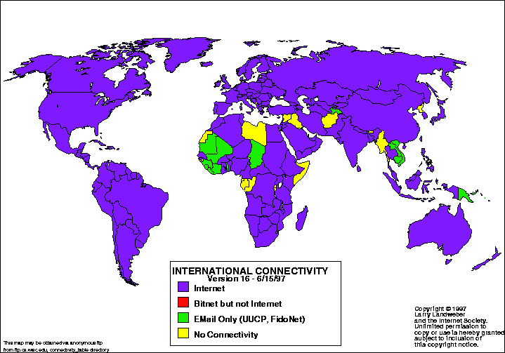
Statistical maps display distance data according to mathematical definitions of space and distance. This statistical map illustrates the spread of Internet throughout the world according to a census taken in 1997. The map explains that most of the world has Internet connectivity except for a few countries, which are in yellow.

Monday, April 19, 2010

Similarity Matrix


http://images.google.com/imgres?imgurl=http://cgi.mtc.sri.com/Cluster-Lab/01.jpg&imgrefurl=http://cgi.mtc.sri.com/Cluster-Lab/&usg=__c0xfgUY4BTTjh9JGHuHLUKrTAOE=&h=388&w=504&sz=82&hl=en&start=8&um=1&itbs=1&tbnid=qy75M8y5Ve7KSM:&tbnh=100&tbnw=130&prev=/images%3Fq%3Dsimilarity%2Bmatrix%26um%3D1%26hl%3Den%26client%3Dfirefox-a%26sa%3DN%26rls%3Dorg.mozilla:en-US:official%26tbs%3Disch:1

Similarity matrices display scores that relate to the relationship between two data points. The data points are marked along the X and Y axis. This similarity matrix represents the strong relationship with a red square and a low relationship with a blue square.

Sunday, April 18, 2010

Bivariate Choropleth Map


http://images.google.com/imgres?imgurl=http://proceedings.esri.com/library/userconf/proc99/proceed/papers/pap171/p1716.jpg&imgrefurl=http://proceedings.esri.com/library/userconf/proc99/proceed/papers/pap171/p171.htm&usg=__rQ09SXfNMLUqlQ1b1d2-a0IMo0o=&h=367&w=637&sz=59&hl=en&start=22&um=1&itbs=1&tbnid=rkp5MWC3Au-0IM:&tbnh=79&tbnw=137&prev=/images%3Fq%3Dbivariate%2Bchoropleth%26start%3D18%26um%3D1%26hl%3Den%26client%3Dfirefox-a%26sa%3DN%26rls%3Dorg.mozilla:en-US:official%26ndsp%3D18%26tbs%3Disch:1

Bivariate choropleth maps display two variables on a single map by using different symbols for each variable. This specific bivariate map represents the 1997 population and also the median house values. The darker colors represent both the higher population and higher median house value.

Nominal Choropleth Map


http://images.google.com/imgres?imgurl=https://www.e-education.psu.edu/files/geog482/image/census_minority_map.jpg&imgrefurl=https://www.e-education.psu.edu/natureofgeoinfo/book/export/html/1553&usg=__Fe_hMLsYfLNawehpe_vIwQ9Q7ew=&h=244&w=500&sz=31&hl=en&start=3&um=1&itbs=1&tbnid=TN4zL_asJEOsHM:&tbnh=63&tbnw=130&prev=/images%3Fq%3Dminority%2Bgroups%2Bin%2Bus%2Bmap%26um%3D1%26hl%3Den%26sa%3DN%26rls%3Dcom.microsoft:*%26tbs%3Disch:1

Nominal choropleth maps are a way to display qualitative data by classifying it into groups. Quanitative values are not used. This specific map illustrates minority groups in the United States by use of color. According to this map, the hispanic race is the most dominant minority group in America.

Continuously Graded Proportional Circle Map


http://images.google.com/imgres?imgurl=https://www.e-education.psu.edu/files/geog482/image/hisp_circles.gif&imgrefurl=https://www.e-education.psu.edu/natureofgeoinfo/book/export/html/1553&usg=__OBn_lecD6pmbS3KT3ovM96T4s1s=&h=376&w=499&sz=19&hl=en&start=22&um=1&itbs=1&tbnid=B97QzdVO51PkDM:&tbnh=98&tbnw=130&prev=/images%3Fq%3DContinuously%2Bgraded%2Bproportional%2Bcircle%2Bmap%26start%3D18%26um%3D1%26hl%3Den%26sa%3DN%26rls%3Dcom.microsoft:*%26ndsp%3D18%26tbs%3Disch:1

Continuously graded proportional circle maps are a type of point pattern map that uses circle to represent numeric data. Unlike range graded circle maps, continuously graded circle maps, the circles come in all sizes. The larger the circle, the larger the numerical value, and the small the circle, the smaller the numerical value. In this specific circle map, the Hispanic population is represented in the United States. According to the size of the circles, it appears that California has the largest amount of people of the Hispanic race in that state.

Dot Density Map


http://images.google.com/imgres?imgurl=https://www.e-education.psu.edu/files/geog482/image/hisp_dots.gif&imgrefurl=https://www.e-education.psu.edu/natureofgeoinfo/book/export/html/1553&usg=__zbqxpxz1IsTkO4VzGuu36it5fAM=&h=373&w=499&sz=18&hl=en&start=66&um=1&itbs=1&tbnid=nCfUo9brWCLHTM:&tbnh=97&tbnw=130&prev=/images%3Fq%3DContinuously%2Bgraded%2Bproportional%2Bcircle%2Bmap%26start%3D54%26um%3D1%26hl%3Den%26sa%3DN%26rls%3Dcom.microsoft:*%26ndsp%3D18%26tbs%3Disch:1

Dot density maps are a type of point pattern map that use dots to represent a certain numerical value. Unlike, continuously graded and range-graded proportional maps, in dot density maps the dots do not vary in size. In this specific dot density map, the hispanic population is represented in the United States. One dot represents 100,000 people of the Hispanic race. It looks as if California, Texas, and Florida have the largest Hispanic population.

Wednesday, April 14, 2010

Cartographic Animation


http://images.google.com/imgres?imgurl=http://uwacadweb.uwyo.edu/JSHINKER/animations/global/gifs/nlwrs_web.gif&imgrefurl=http://uwacadweb.uwyo.edu/JSHINKER/animations/global/&usg=__QIbXN5ZVG3eE7-ogzERnV2Be0-8=&h=458&w=674&sz=224&hl=en&start=14&um=1&itbs=1&tbnid=L3lAljKs9w2rTM:&tbnh=94&tbnw=138&prev=/images%3Fq%3Dcartographic%2Banimations%26um%3D1%26hl%3Den%26sa%3DN%26rls%3Dcom.microsoft:*%26tbs%3Disch:1


Cartographic animations are created so that the viewer can visualize movement and gradual progression of specific data being analyzed. In this cartographic animation, the viewer can see the gradual changes month to month due to the effects of net long-wave radiation. There is a legend below that depicts by color the intensity of the effects--blue being the lowest and red being the highest.

Climograph


http://images.google.com/imgres?imgurl=http://ag.arizona.edu/watershedsteward//resources/module/Climate/images/az-climograph.gif&imgrefurl=http://ag.arizona.edu/watershedsteward//resources/module/Climate/az-climate_pg3.htm&usg=__3dEQilgjGcIZfw6yKyJK34BM22w=&h=341&w=500&sz=15&hl=en&start=21&um=1&itbs=1&tbnid=9KQ96hN1pQd-PM:&tbnh=89&tbnw=130&prev=/images%3Fq%3Dclimograph%26start%3D18%26um%3D1%26hl%3Den%26sa%3DN%26rls%3Dcom.microsoft:*%26ndsp%3D18%26tbs%3Disch:1


A climograph is a graph that illustrates monthly precipitation and temperature conditions for a specific place. This climograph shows the monthly precipitation of Arizona by the bar graph and the temperature condionts by the line graph. It seems that in July and August precipiation and temperature conditions are very high.

Population Profile


http://images.google.com/imgres?imgurl=http://camellia.shc.edu/literacy/tablesversion/assignments/Image2.jpg&imgrefurl=http://camellia.shc.edu/literacy/tablesversion/assignments/statisticsassign.htm&usg=__UQPIlMRDWuMw1D6CYwA93DsfEs4=&h=1568&w=1191&sz=169&hl=en&start=2&um=1&itbs=1&tbnid=x09kvrrl1LjMrM:&tbnh=150&tbnw=114&prev=/images%3Fq%3Dpopulation%2Bprofile%26um%3D1%26hl%3Den%26sa%3DN%26rls%3Dcom.microsoft:*%26tbs%3Disch:1


A population profile is a chart that shows trends of population statistics over time and depicts the data by age. As you can see on this chart, it represents the growing popuulation for Mobile County in 1998. It seems that the male and female population growth from ages 35-44 is nearly identical and it seems to thin out equally as the age groups increase.

Cartogram


http://en.wikipedia.org/wiki/File:Cartlinearlarge.png

Cartograms depict a certain thematic subject, however that thematic subject is represented by land area. For example, this map depicts the votes for the 2004 U.S. Presidential election. The map of the United States is reshaped to illustrate each state's votes.

Flow Map


http://images.google.com/imgres?imgurl=http://www.lib.utexas.edu/maps/texas/combtrk_tx_1998.jpg&imgrefurl=http://www.lib.utexas.edu/maps/texas.html&usg=__lmhw0Vs7CBL3vJcLJjMnz-NcuNg=&h=524&w=723&sz=194&hl=en&start=4&um=1&itbs=1&tbnid=SlE37CWJGyVCEM:&tbnh=101&tbnw=140&prev=/images%3Fq%3Dflow%2Bmap%26um%3D1%26hl%3Den%26client%3Dfirefox-a%26sa%3DN%26rls%3Dorg.mozilla:en-US:official%26ndsp%3D18%26tbs%3Disch:1

Flow maps illustrate the movement and transportation of people or goods from one place to another. This maps shows the total combined truck flows in 1998 by using red curved lines. The thicker lines represent more traffic flow and the thinner lines represent less traffic flow. According to this map, Texas has the highest flow of traffic going out.

Isoline Map


http://images.google.com/imgres?imgurl=http://regentsprep.org/Regents/earthsci/graphics/102A_9-10.gif&imgrefurl=http://regentsprep.org/Regents/core/questions/questions.cfm%3FCourse%3DESCI%26TopicCode%3D07&usg=__MvmHU4eF2FyMRvTfusOnz2XdBY4=&h=390&w=500&sz=10&hl=en&start=20&um=1&itbs=1&tbnid=u0wjwDrUzahu8M:&tbnh=101&tbnw=130&prev=/images%3Fq%3D%2522isoline%2Bmap%2522%26start%3D18%26um%3D1%26hl%3Den%26sa%3DN%26rls%3Dcom.microsoft:*%26ndsp%3D18%26tbs%3Disch:1


An isoline map is a map with continuous lines joining at points of the same value. They show three dimensional figures in two dimensional form by using contour lines. Some examples of isoline maps are isotachs, isobars, and isopleths etc. This map illustrates Jamestown and shows that it is close to a body of water which is shown by the circular contour lines.

Tuesday, April 6, 2010

Propoganda Map


http://www.feld.com/wp/archives/2006/12/the-world-according-to-ronald-reagan.html

Propoganda maps are used by the government to help influence or project a certain idea to the public. Propaganda maps can be very powerful in the act of influencing a certain prospect. This propoganda map shows the world as Ronald Reagan portrayed to Americans. This map gives the idea that Americans thought that President Reagan was very greedy and possessive when it came to the rest of the world.

Thematic Map


http://images.google.com/imgres?imgurl=http://factfinder.census.gov/img/saff/en/wn_10.6_5.png&imgrefurl=http://factfinder.census.gov/jsp/saff/SAFFInfo.jsp%3F_content%3Dsu2_new_features_10_6.html&usg=__-SMDnGoCXB9flD9BkRYh0CxOeTc=&h=504&w=462&sz=120&hl=en&start=17&um=1&itbs=1&tbnid=c40sn0gxo_q12M:&tbnh=130&tbnw=119&prev=/images%3Fq%3D%2522thematic%2Bmap%2522%26um%3D1%26hl%3Den%26sa%3DN%26rls%3Dcom.microsoft:*%26tbs%3Disch:1

A thematic map is a map that displays physical area, but represents some other type of theme, such as cultural, social, economic, political etc. This thematic map is representative of the median family income in the United States during 2006. The lighter greens represent the state's with a lower income and the darker greens represent the state's with a higher income. Hawaii, Alaska, and the upper eastern states near Massachusetts are the states with the highest income in America according to this map.

Topographic Map


http://images.google.com/imgres?imgurl=https://www1.nga.mil/ProductsServices/TopographicalTerrestrial/PublishingImages/350px-Topographic_map_example.png&imgrefurl=http://www1.nga.mil/ProductsServices/TopographicalTerrestrial/Pages/default.aspx&usg=__RqACGgU6dih315-aJatL0X-3UcE=&h=350&w=350&sz=268&hl=en&start=2&um=1&itbs=1&tbnid=d8eieZ_OYTYqRM:&tbnh=120&tbnw=120&prev=/images%3Fq%3D%2522topographic%2Bmap%2522%26um%3D1%26hl%3Den%26rls%3Dcom.microsoft:*%26tbs%3Disch:1

A topographic map is a type of map that is characterized by large-scale detail and quantitative representation of relief, usually using contour lines. Topographic maps show not only contours but also some streams, forestry, and built-up areas. This is an example of a topographic map that shows rivers and hills and other topography using contour lines.

Cadastral Map


http://images.google.com/imgres?imgurl=http://upload.wikimedia.org/wikipedia/commons/4/4b/Old_cadastral_map_of_Praha-Josefov_and_surround_areas.jpg&imgrefurl=http://commons.wikimedia.org/wiki/File:Old_cadastral_map_of_Praha-Josefov_and_surround_areas.jpg&usg=__hDvmYxJxd6buTAphXgEJj9LxyF0=&h=2981&w=3331&sz=6303&hl=en&start=1&um=1&itbs=1&tbnid=IpVaflwh8_XWPM:&tbnh=134&tbnw=150&prev=/images%3Fq%3Dcadastral%2Bmap%2Bof%2BPraha-Josefov%26um%3D1%26hl%3Den%26rls%3Dcom.microsoft:*%26tbs%3Disch:1

A cadastral map is a register of the metes-and-bounds ownership of a country. In the United States, cadastral surveys are responsible for maintaining records of all public lands. This is a cadastral map of Praha-Josefov.

Wednesday, March 31, 2010

Range graded proportional circle map


http://www.neiu.edu/~ejhowens/377/examples.htm

Range graded proportional circle maps show data on a map by using circles in relation to the ranges of data. The larger circles represent larger data and the smaller circles represent smaller data. This map shows the population of Filipinos in the United States. According to the map, Texas has the largest circle which means that Texas has the largest population of Filipinos.

Index Value Plot


http://dfanning.com/graphics_tips/wavenumber.html

Index value plots is a way of showing relativity of values to an indexed plot. This index plot shows the relativity of the wavelength values.

Monday, March 29, 2010

DLG


http://tahoe.usgs.gov/DLG.html

DLG stands for digital line graphs and they show spatial data in vector format, which is shown in points, lines, and polygons. This map shows the roads in a red line, the rivers and lakes in polygon-like figures, and the vegetation in green polygon-like figures.

DOQQ


http://fcelter.fiu.edu/data/


DOQQ stands for digital orthoquarter quads. It is a map produced by georectified raster images developed from aerial photos. DOQQ’s can be shown as false color-infrared photos or in true color. The map I've decided to use as an example is a false color infrared.

DRG


http://images.google.com/imgres?imgurl=http://lter.kbs.msu.edu/maps/GIS/DRG_d.jpg&imgrefurl=http://lter.kbs.msu.edu/maps/gis_data.php&usg=__VaxqDKfw1nQxdpExshqwnZSwVTw=&h=602&w=640&sz=609&hl=en&start=7&um=1&itbs=1&tbnid=EXfqRc2BKG8f3M:&tbnh=129&tbnw=137&prev=/images%3Fq%3D%2522DRG%2522%26um%3D1%26hl%3Den%26sa%3DN%26rls%3Dcom.microsoft:*%26tbs%3Disch:1

DRG, which stands for digital raster graphic and is a scanned image of a U.S. Geological Survey topographic map. In these maps, raster is how the map is represented as you can notice the grid-like squares.

DEM


http://bard.wr.usgs.gov/getDEMSMap.html

DEM stand for digital elevation model and it is a digital representation of ground surface or terrain. There are most commonly used to show relief in geographic information systems. Most of the time, like in this map, DEM's are shown as a raster, which is a grid of squares.

Monday, March 22, 2010

Parallel Coordinate Plot


http://michaelvandaniker.com/blog/

In a parallel coordinate plot, each variable is mapped on a vertical line. A data element is plotted as a connected set of points, which is shown here by a red line. This particular graph shows the relationship between calories, fiber, carbohydrates, sugars, potassium, and vitamins.

Wind Rose


http://www.vistadatavision.com/index.php?page=wind-rose

A wind rose is a circular plot that shows the frequencies of different wind directions. In this wind rose, it is apparent that the wind blew in the western direction the least and blew the most towards the east at 13%.

Star Plot


http://images.google.com/imgres?imgurl=http://upload.wikimedia.org/wikipedia/commons/0/09/MER_Star_Plot.gif&imgrefurl=http://commons.wikimedia.org/wiki/Category:Star_plots&usg=__2vejI3nBiIAtqK53ENebF-pDNPE=&h=438&w=560&sz=28&hl=en&start=1&um=1&itbs=1&tbnid=A6om0JWZVvDnEM:&tbnh=104&tbnw=133&prev=/images%3Fq%3D%2522star%2Bplot%2522%26um%3D1%26hl%3Den%26sa%3DN%26rls%3Dcom.microsoft:*%26tbs%3Disch:1

Star plots allow you to compare multiple variables for each observation. The radii represent different characteristics. Furthermore, star plots allow for easy visualization of multiple variables. This star plot creates a visual of 6 different variables: time, mass, actuator saturation, collision, accuracy, and trajectory.

Thursday, March 18, 2010

Scatter plot


http://images.google.com/imgres?imgurl=http://www.me-jaa.com/mejaa21Mar2009/scatterplot-diag1.gif&imgrefurl=http://www.me-jaa.com/mejaa21Mar2009/scatterplot.htm&usg=__faXSkmnsVPQNgBhJT9KKF_GuRi0=&h=426&w=531&sz=30&hl=en&start=1&um=1&itbs=1&tbnid=4Nn3v8MVd8GisM:&tbnh=106&tbnw=132&prev=/images%3Fq%3Dheight%2Band%2Bweight%2Bscatter%2Bplot%26um%3D1%26hl%3Den%26rls%3Dcom.microsoft:*%26tbs%3Disch:1

A scatter plot shows the relationship between two variables by displaying data points on a graph. The explanatory variable is usually plotted on the x-axis while the response variable is plotted on the y-axis. This specific scatter plot displays the relationship between height and weight. It is a positive relationship because as x increases, so does y. Also, it is a rather strong relationship because the data points remain in close proximity to one another on the line.

Accumulation Plot/Lorenz Curve


http://images.google.com/imgres?imgurl=http://www.mathworks.com/matlabcentral/fx_files/19968/2/Lorenz.jpg&imgrefurl=http://www.mathworks.com/matlabcentral/fileexchange/%3Fterm%3Dtag%253A%2522curve%2522&usg=__2UpFa_q-9hoOUEKU4qtmtMFEIQc=&h=854&w=1280&sz=205&hl=en&start=12&um=1&itbs=1&tbnid=PKrld2gAiPM4LM:&tbnh=100&tbnw=150&prev=/images%3Fq%3D%2522lorenz%2Bcurve%2522%26um%3D1%26hl%3Den%26rls%3Dcom.microsoft:*%26tbs%3Disch:1

An accumulation plot, or Lorenz curve, is a graphical representation of the cumulative distribution, usually of wealth. In this curve, the red line represents what the percentage of wealth would be if it were distributed evenly and the blue line represent how the wealth is actually distributed.

Bilateral Graph


http://www.fdic.gov/regulations/examinations/supervisory/insights/siwin09/index.html


http://www.fdic.gov/regulations/examinations/supervisory/insights/siwin09/images%5Cchart3.jpg

Bilateral graphs are a type of geovisualization maps that compare two variables. On this map, the percentage of assets between 2003 and 2009 is being graphed. The overlapped area on the right displays the an increase in loans while the overlapped area on the left displays a decrease of loans.

Tuesday, March 16, 2010

Isobaric Map


http://images.google.com/imgres?imgurl=http://ruc.noaa.gov/gif/topo-ruc13.gif&imgrefurl=http://ruc.noaa.gov/&usg=__vxwnfG5EGte7iLnn7J-itzhL_xQ=&h=1000&w=1000&sz=109&hl=en&start=8&um=1&itbs=1&tbnid=f0eFlynkjKRekM:&tbnh=149&tbnw=149&prev=/images%3Fq%3Disobaric%2Bmap%26um%3D1%26hl%3Den%26client%3Dfirefox-a%26sa%3DN%26rls%3Dorg.mozilla:en-US:official%26tbs%3Disch:1

Isobaric maps display air pressure. In this map you can use the scale at the bottom to determine that the highest air pressure is on the northwest side from Alaska through California and on through Mexico.

Bathymetric Map


http://images.google.com/imgres?imgurl=http://media.marine-geo.org/files/images/2008-MGDS-259.preview.jpg&imgrefurl=http://media.marine-geo.org/image/ocean-floor-map-iceberg-gouges-ross-sea-2008&usg=__S7f_KUUNSXWwZtQa3y9-25RUhmo=&h=563&w=640&sz=66&hl=en&start=201&um=1&itbs=1&tbnid=Bcr17dYW8ZfWpM:&tbnh=121&tbnw=137&prev=/images%3Fq%3D%2522bathymetric%2Bmap%2522%26start%3D198%26um%3D1%26hl%3Den%26sa%3DN%26rls%3Dcom.microsoft:*%26ndsp%3D18%26tbs%3Disch:1

Bathymetric maps display seafloor elevation. In this map you can see the rise and fall of the ocean floor due to the textured contour lines and elevated lines.

Isohyet Map


http://images.google.com/imgres?imgurl=http://newtide.org/projects/LA_BMP/isohyet_full.jpg&imgrefurl=http://newtide.org/projects_labmp.html&usg=__1YC3Ap3OKrG7ThkOsgI2YNRbiak=&h=317&w=400&sz=57&hl=en&start=1&um=1&itbs=1&tbnid=tLQk63JMZBiHCM:&tbnh=98&tbnw=124&prev=/images%3Fq%3DIsohyet%2Bmap%2522%2Bnewtide%26um%3D1%26hl%3Den%26rls%3Dcom.microsoft:*%26tbs%3Disch:1

Isohyet maps are illustrations of rainfall. This map depicts the amount of rainfall by using the scale on the left. Each color symbollizes a certain measurement. The most rainfall seems to be in the blue areas on the top left corner and center of the map.

Wednesday, March 10, 2010

Isotach Map


http://expert.weatheronline.co.uk/is10_frame.htm

Isotach maps display the wind speed in a certain area the viewer is interested in. The closer the lines are together, the stronger the winds. This specific isotach map is illustrating the windspeed forecast and it appears that the winds are stronger towards the north.

Isopach Map

http://www.volcano.si.edu/volcanoes/region14/mexico/colima/14col15f.png

http://www.volcano.si.edu/world/volcano.cfm?vnum=1401-04=&volpage=var

Isopach maps display rock and sedimentary thickness. This specific isopach map is illustrating the sedimentary thickness of the volcano Colima. The peak of the volcano has the thickest rock equaling 5mm or more, and the thickness of the rocks tend to decrease the further away from the peak.

Hypsometric Map


http://images.google.com/imgres?imgurl=http://www.co.kittitas.wa.us/images/maps/map_wa_relief.jpg&imgrefurl=http://lu.com/odlis/odlis_h.cfm&usg=__29g7Af2qzTUxT83MhY4t-AoTlW4=&h=601&w=1080&sz=192&hl=en&start=10&um=1&itbs=1&tbnid=jSYwcmbhX4CFNM:&tbnh=83&tbnw=150&prev=/images%3Fq%3Dhypsometric%2Bmap%26um%3D1%26hl%3Den%26client%3Dfirefox-a%26sa%3DN%26rls%3Dorg.mozilla:en-US:official%26tbs%3Disch:1


Hypsometric maps are surface maps that display relief and communicate information three dimensionally. The third dimension can be displayed by use of color and shaping, coutour lines, or raised relief. This map of the earth displays the third dimension and elevation by use of color, shaping, and texture.

Planimetric Map


http://sst.rncan.gc.ca/2002_2006/gnd/plan_yt_e.php

Planimetric maps are surface maps that show no relief features. They are strictly two-dimensional and do not display information 3-D contrast. This is a planimetric map that illustrates the Yukon and as you can tell it is 2-D surface and there are no three dimensional features.

Unclassfied Choropleth Map


http://images.google.com/imgres?imgurl=http://www.esds.ac.uk/international/images/cia2004.gif&imgrefurl=http://www.esds.ac.uk/international/news/pastnews.asp&usg=__yVlNfNZ1WazHRTeuSflwD5aeaCo=&h=325&w=425&sz=35&hl=en&start=15&um=1&itbs=1&tbnid=8tR5T9MsxASdsM:&tbnh=96&tbnw=126&prev=/images%3Fq%3Dfrench%2Bunclassed%2Bchoropleth%26um%3D1%26hl%3Den%26sa%3DN%26rls%3Dcom.microsoft:*%26tbs%3Disch:1


Unclassified choropleth maps use the technique of assigning color shadings in proportion to the data values. Many cartographers dislike these types of maps because they are unable to classify the information and they feel as if they're losing the ability to communicate the message to the viewer. This map shows the number of internet users in the eastern hemisphere. The colors are assigned to dictate number.

Tuesday, March 9, 2010

Unstandardized Choropleth Map


http://images.google.com/imgres?imgurl=http://morristsai.com/assets_c/2008/10/2008pre-electionmap-thumb-400x299.png&imgrefurl=http://morristsai.com/cgi-bin/mt/mt-search.cgi%3Fsearch%3DBush%26IncludeBlogs%3D1%26limit%3D10%26page%3D2&usg=__S0ES2ssRhxgY6eaZP2Z2sG6DeSo=&h=299&w=400&sz=85&hl=en&start=2&um=1&itbs=1&tbnid=0GROr6ZB2QnggM:&tbnh=93&tbnw=124&prev=/images%3Fq%3D2008%2Bpolitical%2Bmap%26um%3D1%26hl%3Den%26rls%3Dcom.microsoft:*%26tbs%3Disch:1

Unstandardized Choropleth maps display information without areally averaging the data in any way. This specific map displays a prediction of the 2008 Presidential Election. Blue represents the democrats and red represents the republicans. The information is not averaged by percentage nor by density per square mile.

Standardized Choropleth Map


http://images.google.com/imgres?imgurl=http://upload.wikimedia.org/wikipedia/commons/7/78/USA_states_population_density_map.PNG&imgrefurl=http://commons.wikimedia.org/wiki/File:USA_states_population_density_map.PNG&usg=__K4HkJVwk1v1Pm8hNkdsvdevkIAE=&h=581&w=936&sz=37&hl=en&start=17&um=1&itbs=1&tbnid=iZpDKZY2vIrhDM:&tbnh=92&tbnw=148&prev=/images%3Fq%3Dus%2Bpopulation%2Bmap%2B2000%26um%3D1%26hl%3Den%26sa%3DN%26rls%3Dcom.microsoft:*%26tbs%3Disch:1


A standardized choropleth map is an areally averaged map. Cartographers usually display information by percentages or by density per square mile, which is shown here. This is the United States Population displayed by square mile.

Univariate Choropleth Map


http://images.google.com/imgres?imgurl=http://www.cdc.gov/pcd/issues/2007/oct/images/07_0091_01.gif&imgrefurl=http://www.cdc.gov/pcd/issues/2007/oct/07_0091.htm&usg=__k4kqV3NzNI8cXuyYoavBItSp1io=&h=330&w=450&sz=42&hl=en&start=66&um=1&itbs=1&tbnid=zDSsK9QPFFehRM:&tbnh=93&tbnw=127&prev=/images%3Fq%3Dunivariate%2Bchoropleth%2Bmap%26start%3D54%26um%3D1%26hl%3Den%26sa%3DN%26rls%3Dcom.microsoft:*%26ndsp%3D18%26tbs%3Disch:1

A univariate chloropleth map displays only one variable on a single map. In this specific case, this map displays one variable, poverty rates in the United States. The darker colors represent the higher percentages and it appears that the south as more individuals living in poverty.

Thursday, March 4, 2010

Infrared Aerial Photo


http://images.google.com/imgres?imgurl=http://www.nature.com/nbt/journal/v23/n2/images/nbt0205-165-I1.jpg&imgrefurl=http://www.nature.com/nbt/journal/v23/n2/full/nbt0205-165.html&usg=__lCQafxggNiSeC2JM6N16gvmQRxU=&h=311&w=440&sz=58&hl=en&start=9&um=1&itbs=1&tbnid=ocvPpGgNiiuNSM:&tbnh=90&tbnw=127&prev=/images%3Fq%3Dinfrared%2Baerial%2Bphoto%2Bof%2Bnature%26um%3D1%26hl%3Den%26rls%3Dcom.microsoft:*%26tbs%3Disch:1

Infrared aerial photography is able to show wavelengths that fall outside the range of human vision. IR film is commonly used to produce color-infrared photos since we can't see the wavelengths recorded on infrared film. Furthermore, this infrared aerial photo illustrates a picture of a forest taken from above. The red color in the picture represents the shapes and forms of the trees that we wouldn't normally be able to see.

Black and White Aerial Photo


http://terraserver-usa.com/usgsentry.aspx?T=1&S=11&Z=17&X=1075&Y=8378&W=2&qs=cassat+ave.%7cJacksonville%7cFL%7c&Addr=Cassat+Ave%2c+Jacksonville%2c+FL+32205&ALon=-81.7308086&ALat=30.3175602

Aerial photos are another type of remote sensing. Aerial photography is a type of photography in which you take pictures of the ground from an elevated position. Black and white emulsion is sensitive to approximately the same wavelengths as the human eye and therefore, false color isn't necessary since we can already see the wavelengths recorded. This black and aerial photo illustrates Cassat Ave in Jacksonville, Florida (my hometown) which is a suburb, as you can see the houses, trees, roads, and neighborhoods from above.

Lidar Remote Sensing


http://images.google.com/imgres?imgurl=http://pubwiki.extension.org/mediawiki/files/7/7c/Lidar.jpg&imgrefurl=http://www.extension.org/pages/LIDAR_Derived_Products&usg=__dfC2k5nJf8l_FVUfRon7AkuDghI=&h=307&w=350&sz=80&hl=en&start=4&um=1&itbs=1&tbnid=sctVEfoswHffgM:&tbnh=105&tbnw=120&prev=/images%3Fq%3Dlidar%2Bremote%2Bsensing%2Bextension%26um%3D1%26hl%3Den%26sa%3DN%26rls%3Dcom.microsoft:*%26tbs%3Disch:1

Lidar remote sensing uses a laser (light amplification by stimulated emission of radiation) instead of radio or microwave radiation. A lidar sensor is associated with the highest features in the landscape. In this specific map's case, the highest feature is the tops of buildings. Lidar is used used to generate elevation maps and identify other landscape characteristics.

PLSS Map


http://images.google.com/imgres?imgurl=http://gis.nwcg.gov/giss_2006/job_aids/maps_and_graphics/USA_PLSS_Meridians_map.jpg&imgrefurl=http://gis.nwcg.gov/giss_2006/cd_contents.html&usg=__6fwSrzU16-Z48U9DJZUVEjApsv8=&h=1095&w=1595&sz=812&hl=en&start=3&um=1&itbs=1&tbnid=kcYAKM5FpuL4SM:&tbnh=103&tbnw=150&prev=/images%3Fq%3DPLSS%2Bmap%26um%3D1%26hl%3Den%26sa%3DN%26rls%3Dcom.microsoft:*%26tbs%3Disch:1

A PLSS map, which stands for Public Land Survey System, is a type of map that facilitates ownership. It is a way to subdivide and describe land in the United States systematically and fairly. The original PLSS surveys were often marked by wooden stakes or posts, marked trees, pits, or piles of rock, or other less-permanent markers, and therefore were not systematic. A PLSS map begins at an initial point and the north-south line that passes through it is called the prime meridian and the east-west line that passes through it is called the base line.

Doppler Radar


http://images.google.com/imgres?imgurl=http://www.weatherusa.net/blog/images/doppler-orlando-1943.gif&imgrefurl=http://www.weatherusa.net/blog/index.php%3Fmonth%3DAugust_2004&usg=__amiyWLxk0F-njvBo88N6JATaizQ=&h=620&w=620&sz=51&hl=en&start=3&um=1&itbs=1&tbnid=-lqo28ggXCXHhM:&tbnh=136&tbnw=136&prev=/images%3Fq%3Ddoppler%2Bradar%26um%3D1%26hl%3Den%26sa%3DN%26rls%3Dcom.microsoft:*%26tbs%3Disch:1

This doppler radar of South Florida uses a transmitter to emit either radio or microwave radiation and a directional antenna to receive and measure the time of arrival of reflected pulses from distant objects. This radar image illustrates a hurricane that is on top of the South Florida area in 2004.

Wednesday, February 24, 2010

Choropleth Map


http://images.google.com/imgres?imgurl=http://www.bsu.edu/ibb/US/Map/Rug/gmap2.gif&imgrefurl=http://www.bsu.edu/ibb/US/Map/Rug/index.htm&usg=__sCQzuiY3FIB7-LTwR-r3gE1nQ94=&h=400&w=400&sz=6&hl=en&start=1&um=1&itbs=1&tbnid=j4wYeNWPMPNziM:&tbnh=124&tbnw=124&prev=/images%3Fq%3Dchoropleth%2Bmap%2Bstate%2Bunemployment%2Brates%26um%3D1%26hl%3Den%26rls%3Dcom.microsoft:*%26tbs%3Disch:1

Choropleth maps display areal data. A common way to areally average choropleth map data is to either use percentages, which is shown in this map, or denisty (persons per square mile). As shown in this choropleth map, the yellow states' unemployment rate is less than 7.4%, the green states' rate is 7.4%-9.0%, the blue states' rate is 9.0%-10.9%, and the red states' rate is over 10.9%.

Histogram


http://images.google.com/imgres?imgurl=http://image.tutorvista.com/Qimages/QD/49448.gif&imgrefurl=http://www.tutorvista.com/q/the-histogram-shows-the-math-test-scores-of-some-seventh-graders-how/q13765_86980&usg=__vDbLKonTpZH-IXs-KdcVn92b04w=&h=170&w=220&sz=2&hl=en&start=20&um=1&itbs=1&tbnid=VEz56xhrZnjStM:&tbnh=83&tbnw=107&prev=/images%3Fq%3Dhistogram%2Btest%2Bscores%26start%3D18%26um%3D1%26hl%3Den%26client%3Dfirefox-a%26sa%3DN%26rls%3Dorg.mozilla:en-US:official%26ndsp%3D18%26tbs%3Disch:1

A histogram is a graphical display of frequencies, shown as bars, that shows what proportion falls into each category. It is different from a bar graph because the bars are not separated from one another. In this histogram students' test scores are displayed. The height of the bars display how many students fit into each category. As shown, 4 students made a test score of 50-59, 6 made a score of 60-69,10 made a score of 70-79, 8 made a score of 80-89, and 2 made a score of 90-99.

Friday, February 19, 2010

Box Plot


http://images.google.com/imgres?imgurl=http://edubuzz.org/blogs/nbhs3x1/files/2007/01/boxplot-2.JPG&imgrefurl=http://edubuzz.org/blogs/nbhs3x1/2007/01/08/8-jan-2007-five-figure-summary-and-box-plots/&usg=__NkA8yLZjEvI5UmMYMC079fYx4Jc=&h=406&w=958&sz=25&hl=en&start=3&um=1&itbs=1&tbnid=8dHfnbx2F82E9M:&tbnh=63&tbnw=148&prev=/images%3Fq%3Dbox%2Bplot%26um%3D1%26hl%3Den%26rls%3Dcom.microsoft:*%26tbs%3Disch:1

A box plot is a convenient way of graphically depicting groups of numerical data through their five number summaries. This box plot depicts the annual snow depth a Mathsville Ski Resort. The five number summary consists of the minimum value, so in this case it would be 25, the lower quartile (55), the median (78), the higher quartile (101), and the maximum value (130). Therefore, the median snow depth would be around 78.

Correlation Matrix


http://images.google.com/imgres?imgurl=http://yin.che.wisc.edu/images/ProteinMatrix.jpg&imgrefurl=http://yin.che.wisc.edu/images.htm&usg=__u__NVmwj_A-AyVDjgqNfJdmavVE=&h=532&w=627&sz=43&hl=en&start=1&um=1&itbs=1&tbnid=dYKjnVgUVSLaKM:&tbnh=115&tbnw=136&prev=/images%3Fq%3Dcorrelation%2Bmatrix%26um%3D1%26hl%3Den%26client%3Dfirefox-a%26sa%3DN%26rls%3Dorg.mozilla:en-US:official%26tbs%3Disch:1

A correlation matrix is a matrix displaying the relationship between a pair of data sets and serves as a general term to describe the fact that two (or more) variables are related. This correlation matrix displays the data that correlates the bahavior between protein and phage T7. The highest correlation is represented by the color red and the lowest correlation is represented by blue. According to the matrix, there is a correlation between the two, which is shown by the straight line of red blocks.

Tuesday, February 16, 2010

Mental Map


http://images.google.com/imgres?imgurl=http://www.uky.edu/~ulack/Geo152/unnumbered%2520figure%2520pg%252003.jpg&imgrefurl=http://www.uky.edu/~ulack/Geo152/Syllabus152Fall05.htm&usg=__G3FPpe3cVUmmFbDJXhDsRQXQP_8=&h=996&w=1400&sz=306&hl=en&start=2&um=1&itbs=1&tbnid=W6fxTloIZI2VbM:&tbnh=107&tbnw=150&prev=/images%3Fq%3Dmental%2Bmap%26um%3D1%26hl%3Den%26rls%3Dcom.microsoft:*%26tbs%3Disch:1

This is a mental map that a child created to describe their neighborhood. As you can see, the map is not drawn to scale and there definitely was not a certain projection used to display an accurate map of the shape, area, or distance of his or her neighborhood. There is obvious distortion in the size of the houses and buildings, and distance between each of them however; it is the child's personal perception of his or her neighborhood of Coal City, Illinois in the 1940s.

Tuesday, January 12, 2010

Stem and Leaf Plot


http://images.google.com/imgres?imgurl=http://image.tutorvista.com/Qimages/QD/50889.gif&imgrefurl=http://www.tutorvista.com/q/the-average-height-of-10-students-in-a-class-is-represented-in-the/q117416_0&usg=__9qtCBcfenV1A1-jh99AVbwH5-GY=&h=169&w=244&sz=2&hl=en&start=15&um=1&itbs=1&tbnid=J0jzvxaxXDmffM:&tbnh=76&tbnw=110&prev=/images%3Fq%3Dstem%2Band%2Bleaf%2Bweight%2Bof%2Bstudents%26um%3D1%26hl%3Den%26sa%3DN%26rls%3Dcom.microsoft:*%26tbs%3Disch:1

Stem and leaf plots convey the frequency of students' weights in a class according to kilograms. The numbers to the left (the "stems") represent the ten's place and the numbers to the right (the "leaves") represent the one's place. The map displays that 15 kilograms is the most frequent weight in this given class and the majority of the students' weight is under 20 kilograms.